BRAND CONCEPT
品牌理念
Select Safety ● Part Of Your Excellence
SAFETY-INXS has its roots in China. The company’s Chinese name sound like ‘Select’ in English, indicating our products and services’ ability to meet our customers’ exacting standards, which is of paramount importance to safety protection products and solutions. SAFETY-INXS has garnered over 20 years of experience in the safety products industry. Serving our customers with confidence and a smile, we strive to provide the best-quality products and solutions for our customers, teaming up with top names in the global safety products industry and winning high levels of market and customer recognition.
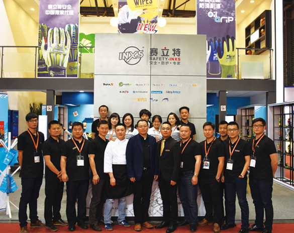

We have refined our product branding as we have grown:
- Safety:Constantly deliver the reliable safety product solution;
- Efficiency:Simplify the process and communication, being practical;
- Loyalty:Deliver our accountability and build up strong relationships with our partners;
- Exalt:Never stop learning to improvement our products and service;
- Creation:Out of the box ideas, out-think the competition;
- Team:Staff are our most valued assets, coach and encourage them. You will never alone!
Origin and Development of Our Logo:
The ‘SAFETY’ in our brand name refers to our safety products. ‘INXS’ stands for ‘in excess’, reflecting our ability to exceed our customers’ expectations, as well as our determination to break through barriers and embrace countless possibilities, delivering creative and groundbreaking product solutions. Together with our Chinese brand name ‘赛立特’, we want to show our customers that putting faith in us is putting faith in infinite possibilities. We have also integrated ‘X’ as a design element into our products.
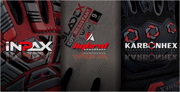

Development of SAFETY-INXS Visual Identity
Over 20 years of experience and growth have culminated in the latest upgrade and expansion of our production facilities in 2017, with our homegrown product designs winning numerous awards at home and abroad. Our visual identity has developed too, to reflect our more mature corporate profile, selecting a combination of black, gray and red over the original blue as our new corporate colors. Black, gray and red respectively represent dignity, grace and dynamism, qualities built up over the past fifteen years, demonstrate to our customers and users the stability, esthetics and compatibility of our safety protection products, and demonstrate our fresh creative designs and cutting-edge branding strategies to the wider world.


